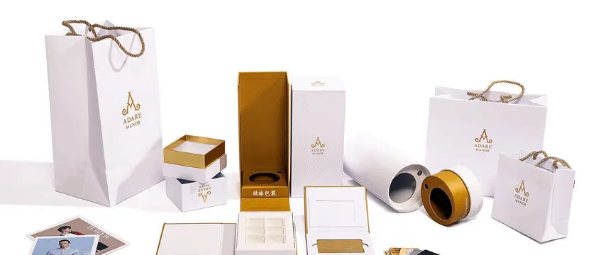
Custom packaging fails in predictable places. Not in the printing—Chinese packaging factories run world-class equipment—but in the handoff: a dieline that was never properly locked, colors specified in the wrong system, and a proofing step skipped to save a week. Each failure costs a reprint, which costs more than the entire first order. Here is how to structure the process so it does not happen to you.
Step 1: Lock the Dieline Before Any Artwork
The dieline is the flat engineering drawing of your package—cut lines, fold lines, glue flaps, bleed—usually delivered by the factory as an Adobe Illustrator template keyed to their equipment. Everything that goes wrong structurally (cartons that do not close, windows misaligned with the product, inserts that rattle) traces back to skipping this step.
The rules:
- Always work from the factory’s template, not a generic one downloaded from a design site. Fold tolerances and glue-flap dimensions are machine-specific.
- Prototype before printing. Request a white sample (blank, unprinted, die-cut from the actual board) to verify fit with your physical product—length, width, height, and insert behavior. Test it the way a customer would: open, close, stack, ship one across the room.
- Version-control the dieline. When the structure is approved, have the factory stamp or mark the template as final. Designers tweaking “one small dimension” after approval is the top cause of misprinted runs.
Step 2: Specify Color in the Right System
This is where packaging briefs most often break. Two systems are in play, and they are not interchangeable:
CMYK (process printing) builds colors from four inks on press. It is economical and handles photographic gradients well—but it carries tolerance: the same file printed on two presses, or the same press on two days, can shift noticeably. Expect roughly ±5% variation; blues and oranges drift most.
Pantone (spot color) pre-mixes an exact ink to a numbered swatch—the Pantone Matching System, with each color identified by a “PMS” number plus a suffix for the stock (C for coated, U for uncoated). Spot colors are consistent across runs and across factories. Pantone itself publishes the conversion bridge, and the standard buyer advice holds: convert Pantone to CMYK only with the published bridge values, and expect a visible shift on some colors—bright oranges, deep blues, and metallic tones.
The practical specification:
- Brand colors and logos: Pantone spot. Name the PMS numbers (with C/U suffix) in the PO. This is non-negotiable for brand consistency across reorder batches.
- Photography and gradients: CMYK, with color expectations set by a contract proof, not by your screen.
- Never trust screens. RGB monitors cannot display either system accurately. The only valid reference is a physical proof.
Step 3: Proofing—The Step That Pays for Itself
Factories offer a ladder of proofing options, and the choice should scale with order size:
- PDF soft proof: free, instant. Catches typos, layout errors, and font problems. Approves nothing about color or structure.
- Digital/cromalin proof: a calibrated single-copy print of the actual artwork. Verify color-critical elements here before committing to a full run.
- Physical pre-production sample: the full package—printed, die-cut, assembled—with your actual product inside. For orders above a few thousand dollars, this step is cheap insurance and the correct approval gate.
Write the approval chain into the purchase order explicitly: white sample approved → artwork proof approved → pre-production sample approved → mass production. A factory that ships without the contracted pre-production approval owns the reprint cost—that clause belongs in every packaging PO.
Step 4: The Details That Differentiate
- Material honesty: specify board by name and gram weight (e.g., “350gsm white card,” “E-flute corrugated,” “157gsm art paper mounted on 1200gsm greyboard” for rigid boxes). “Premium cardboard” is not a specification.
- Finishes in writing: matte/gloss lamination, spot UV, foil stamping, embossing—each is a separate line item with a cost. Factories quote “as pictured,” so picture precisely with reference samples.
- Tolerance disclosure: printing registration, die-cut variance, and color drift all have physical tolerances. Asking the factory to state theirs in writing prevents “that’s within tolerance” surprises.
Sourcing Geography
China’s packaging capacity clusters in a handful of cities, and the concentration matters for sampling speed—dielines, white samples, and pre-production proofs all move faster when the print shop is an hour from your product factory rather than an ocean away. The Wenzhou region (including Longgang, historically China’s printing-specialized county) anchors one of the densest packaging clusters, covered in our Wenzhou packaging cluster profile. For e-commerce-focused brands, pairing a Guangdong product factory with a Guangdong packaging supplier keeps the pre-production loop inside one-day courier range.
Ready to brief a packaging factory that gets it right the first time? Browse eco-packaging and custom packaging manufacturers, or Submit your RFQ with your dieline and color specs to get matched with print houses that honor the proofing chain.